Niklas Hambüchen (nh2) changed the title from Keyboard shortcuts are not not easy to parse visually to Keyboard shortcuts are not not easy to parse visually
Michael Muré (MichaelMure)
added label
enhancement
Michael Muré (MichaelMure)
added label
area/ui/terminal
Michael Muré (MichaelMure) commented
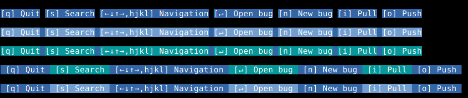
That's a good point. Not sure which one to choose, screen space is expensive there ...
Another solution would be to move them over a special keybinding popup but that does make it less discoverable.
Niklas Hambüchen (nh2) commented
Another solution would be to move them over a special keybinding popup but that does make it less discoverable.
I would definitely keep it on by default, for new users it is super important to learn what they can do pressing what, I would not have had as good as an experience trying git-bug without it.
Not sure which one to choose, screen space is expensive there ...
If you are concerned about screen space, the approach with colours or "Use a connecting symbol" are the most conservative. They use exactly as much space as what's there currently.
For symbols, I think my current visual favourites are dots or triangles
What I'm wondering is if it makes it easier to read the first time but more obnoxious/invading after ...
Niklas Hambüchen (nh2) commented
What I'm wondering is if it makes it easier to read the first time but more obnoxious/invading after ...
I'll use it a it and report back, but I personally find it much less invading if with 1 eye flick I can double-check the key binding -- I find it more distressing/distracting if I have to start searching, so :+1:
Michael Muré (MichaelMure) commented
@nh2 How do you feel about it now ? Looking back at it, it feels a bit aggressive to me with the hard blue/black transition. I also liked having the whole help bar colored instead of just the section with text.