In all TermUI views there always seems to be a space for an empty frame around the main view, which results in two columns and most importantly two lines of wasted space.
Could this space be removed?
I could contribute such a change.
Michael Muré (MichaelMure) commented
Some of the spacing are helpful for readability imho but yes, contribution much welcome. It's not something that has had a lot of attention.
Still seems very readable to me thanks to the coloring. In general I do not find frames useful, unless it's a modal window where some separation is necessary.
But of course, it's to you to decide :)
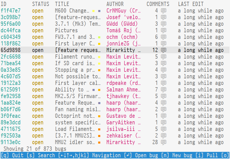
I find the bug table view quite convenient when scanning for issues compared to regular ls (with the cycle: search/narrow/examine/repeat).
"COMMENTS" still takes a lot of space IMHO, which I'd shorten to CMT, along with "LAST EDIT" (which seems always "a long while ago" for some reason), so that the author/title can get wider without having to enter the bug.
Michael Muré (MichaelMure) commented
Damn, though choice. I agree that it's still readable but I also find the extra separating space visually relaxing. Maybe a good compromise would be to remove only the top spacing ? What do I know, I'm no designer ;)
I find the bug table view quite convenient when scanning for issues compared to regular ls (with the cycle: search/narrow/examine/repeat).
Yeah that's the idea. The low level CLI commands are really meant for scripting and integration into other tools.
"COMMENTS" still takes a lot of space IMHO, which I'd shorten to CMT
I could see that happening. Is CMT a common way to abbreviate comment though? I'm not native.
There is also a bug in this column: when no extra comment has been made on a bug after the creation, 0 💬 should be displayed there, or even nothing.
with "LAST EDIT" (which seems always "a long while ago" for some reason)
Damn, though choice. I agree that it's still readable but I also find the extra separating space visually relaxing. Maybe a good compromise would be to remove only the top spacing ? What do I know, I'm no designer ;)
For terminal UIs space generally comes as a premium. Then again, it's probably one of those things that needs some sort of configuration as it's never going to satisfy everybody.
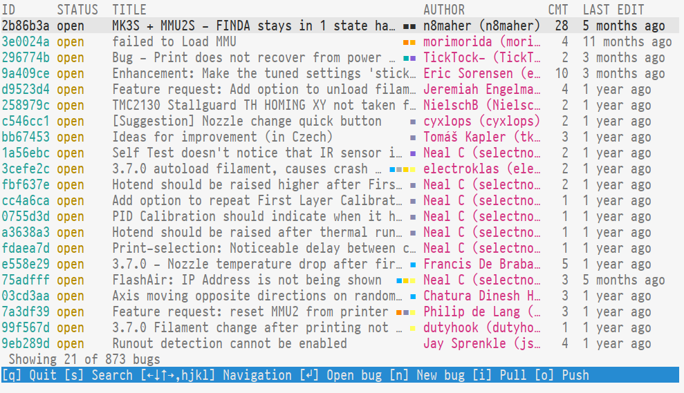
After fiddling some more, this is what I get:
I removed the extra spaces between columns (except for last edit, since both columns are numbered). The space between the labels has gone too, except for a single separator between the label and the text, to conserve space in issues which are labeled with 4+ colors. With "CMT" as 3, it fits all issues up to 999, which is more than enough while also giving an average space of 2.
The "LAST EDIT" column at 16 still fits all values except for "a long while ago", which would be dumb to optimize for ("a long ago" or "a while ago" would perhaps be better).
As an argument for a config file, the hash length shouldn't probably be hard-coded, but at the very least fetched from the git config. Having used "tig" for quite a while, I'm also a big fan of the abbreviated dates ("2d" to indicate "2 days ago"), but having that as a default is probably going to throw off some people. Similarly, tig also does a great author abbreviation (which is also configurable) to conserve more space. After all, the "sauce" of the view should be the issue title.
with "LAST EDIT" (which seems always "a long while ago" for some reason)
this is due to #426
Thanks a lot for this! Now it works.
Michael Muré (MichaelMure) commented
For terminal UIs space generally comes as a premium. Then again, it's probably one of those things that needs some sort of configuration as it's never going to satisfy everybody.
Definitely. git-bug already use the git config here and there to configure behaviors (git-bug.webui.open for example). A git-bug.termui.dense option could make sense. That said, some of your changes make sense regardless.
After fiddling some more, this is what I get:
The comment column is definitely better.
As an argument for a config file, the hash length shouldn't probably be hard-coded, but at the very least fetched from the git config.
Imho this is more of a hash collision issue than a UI question. The length of a "for human" hash is defined only once in the core and all UIs use that. git itself use a single length when abbreviating a hash. 7 characters should be fine even for a dense UI, right?
Having used "tig" for quite a while, I'm also a big fan of the abbreviated dates ("2d" to indicate "2 days ago"), but having that as a default is probably going to throw off some people.
For now this is done by using the default function of go-humanize. It seems to be possible to have a denser version. Maybe this could be tied to the same dense config ?
Similarly, tig also does a great author abbreviation (which is also configurable) to conserve more space.
How so?
Michael Muré (MichaelMure)
added label
enhancement
Michael Muré (MichaelMure)
added label
area/ui/terminal
Yuri D'Elia (wavexx) commented
On Wed, Jul 15 2020, Michael Muré wrote:
git itself use a single length when abbreviating a hash. 7
characters should be fine even for a dense UI, right?
I think the current length is fine.
It was more of a discussion seeing the column lengths as fixed
currently, knowing there will be a change probably along the hash
transition.
I wish I could almost switch the ID to the "upstream" bug ID (relegating
git-bug's ID in the detailed view) when working with a bridge.
For now this is done by using the default function of go-humanize.
It seems to be possible to have a denser version. Maybe this could be
tied to the same dense config ?
I guess. I never program in go, so I'm totally ignorant here. Is there a
standardized way to specify flexible format strings that we could allow
the user to define?
Similarly, tig also does a great author abbreviation (which is also configurable) to conserve more space.
How so?
Looking again at the doc, this is simply done by taking the initials of
the name, stripping punctuation and leaving the last name extended (if
there's space for it).
So Yuri D'Elia becomes YDelia, Michael Muré would be MMuré.
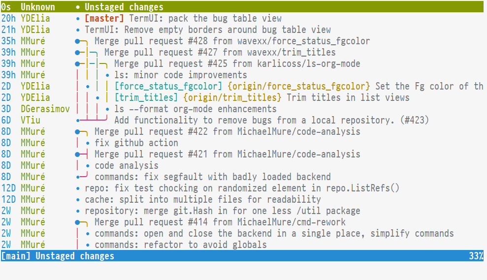
Yuri D'Elia (wavexx) commented
An example of tig's abbreviated dates + authors.
Leaves most of the space free for the commit graph/summary, which is great.
Michael Muré (MichaelMure) commented
I guess. I never program in go, so I'm totally ignorant here. Is there a standardized way to specify flexible format strings that we could allow the user to define?
I was thinking about this function specifically. git-bug use the simpler version that use a pre-defined message array but you can use your own with this one.
Michael Muré (MichaelMure) changed the title from TermUI: dense UI to TermUI: dense UI
Michael Muré (MichaelMure) commented
@wavexx are you planning to make a PR for this? That'd be great.
Yuri D'Elia (wavexx) commented
I currently have a few commits for this dense layout, but there is no setting to switch between normal/compact mode really.
Do you want to keep the ability to use the old layout?
Michael Muré (MichaelMure) commented
Some/most of those improvements should probably in the "normal" layout but I guess we should keep a way to choose between normal and dense (with a git config).
Could you list the changes you have so we can decide which is which ? Or maybe choose yourself.
Yuri D'Elia (wavexx) commented
Let's do it this way? Do you see something in the last screenshot you don't like?
I've used it for several days now, I find it very readable thanks to the coloring. It doesn't feel cramped to me.
I was actually thinking to do something similar to the colorized "ls" formatter too (using the $COLUMS env for proper lenght), following pretty much the same structure.
Michael Muré (MichaelMure) commented
Heh, I suppose you are right and a single "dense" version would work. Could you just post a screenshot with a bigger window so I can finally make up my mind?
I was actually thinking to do something similar to the colorized "ls" formatter too (using the $COLUMS env for proper lenght), following pretty much the same structure.
I welcome those improvements ;) What is that $COLUMNS env variable though?
Michael Muré (MichaelMure) commented
@wavexx could you push your changes in a branch somewhere or even open a PR?
Yuri D'Elia (wavexx) commented
I just pushed what I had at this moment, so not much changed since the screenshot.